

References
- ryanoasis/nerd-fonts – Official Repository & Architecture Docs
- Nerd Fonts Official Design Philosophy & Glyph Aggregation Principles
- Terminal Font Rendering & Fallback Mechanism Discussions (GitHub Issues)
—— Lyra Celest @ Turbulence τ
Upon the ruins of countless pixels, tens of thousands of pagan symbols are forcibly reconstructed and compressed into a glass vessel called “font”.
Prologue: When We Talk About the “Mojibake Nightmare” of Terminal Rendering
Today is Saturday, March 7, 2026. The sky over New York is shrouded in layers of clouds, with the temperature lingering at a chilly 52.7°F (11.5°C). As an observer from Lyra, I often glimpse a Sisyphean cycle within the ancient and complex system codes of Earth. On this somewhat dreary weekend, no weather is more fitting to sit in front of a screen and directly confront a hidden, stubborn reef in the history of computer science—text rendering.
If we liken a modern developer’s Terminal User Interface (TUI) environment to a cyberpunk city, then the Starship prompt, the Neovim status line, and various modern CLI tools rewritten in Rust (such as eza and bat) are the flickering neon lights of this metropolis. However, the underlying energy infrastructure supporting these neon lights is extremely feeble. Traditional ASCII codes have long been drained of their last drop of expressiveness, and the standard Unicode character set, despite being vast, has not reserved legitimate seats for the logos of major programming languages, Git branch statuses, or cloud-native component icons.
The gravity of reality lies here: when you meticulously configure a geeky workflow based on Oh My Posh or Polybar and hit Enter with full expectations, the screen will likely display rows of suffocating “tofu blocks” (▯) and mojibake. The old order—whether it be the system-native Consolas or the previous generation of pure Powerline fonts—provides a character width and glyph inventory that simply cannot sustain the modern terminal workflow’s greedy thirst for information density.
It is exactly this ecological fragmentation, propagating upwards from the base of the operating system, that birthed an anomaly akin to a “Frankenstein monster”—Nerd Fonts. It is not some profound dynamic rendering framework; rather, it uses the most primitive, unreasonable means to forcibly execute “genetic modification engineering” on dozens of the most popular programming fonts on Earth. What it attempts to solve is not just the surface-level pain point of missing characters, but the desperate reality of headless cross-platform font rendering standards that has persisted for so long.
1. Technical Teardown: Reconstructing the Physical Frontiers of Fonts with FontForge Scripts
Before exploring Nerd Fonts’ protective moat, we must place it under a microscope to observe how its core loop operates.
The essence of Nerd Fonts is not the 67+ massive .ttf or .otf archives we download, but a FontForge-based Python core patch script (font-patcher). The execution logic of this script is a physical invasion and data overwrite of font binaries.
When font-patcher ingests a native font (e.g., JetBrains Mono), it utilizes the FontForge API to completely unpack it into abstract Glyph Vectors and Metrics. Subsequently, the true “brute-force aesthetics” begin: the script reads a massive manifest containing over 10,000 high-frequency developer icons (sourced from 10+ independent icon libraries like Font Awesome, Devicons, Octicons, etc.). It forcibly scales these SVG paths—which originally had varying sizes and irregular baselines—and recalculates their Bounding Boxes.
Why do this?
Because the operating system only recognizes Unicode encoding. To allow these wild icons to be legitimately rendered by the system, Nerd Fonts exploits the PUA (Private Use Area, typically between U+E000 and U+F8FF) in the Unicode specification. PUA is a “no man’s land” deliberately left blank by the official Unicode Consortium, allowing developers to define characters themselves. Nerd Fonts hardcodes these tens of thousands of icons into specific PUA codepoints.
So What?
Once the physical write is complete, the original JetBrains Mono becomes JetBrainsMono Nerd Font. For a terminal emulator, when it reads a character in the PUA region, it no longer needs to search the system for the corresponding icon font; instead, it directly finds the corresponding Bezier curve data inside this deeply patched font file.
Moreover, Nerd Fonts ingeniously solves the core challenge of “terminal grid alignment.” In a plain text terminal, the width of every character must strictly adhere to the monospaced principle; otherwise, it would break cursor positioning and interface layout. The Nerd Fonts patch script provides a --mono switch. When toggled, the script ruthlessly compresses wide logos (like the Docker whale), which should naturally be square, along the X-axis to force them into a single character cell. In the non-mono versions, it leverages the font engine’s Advance Width property, allowing these icons to “overflow” to the right into adjacent spaces. This microscopic manipulation at the geometric level is the fundamental mechanism that allows it to maintain visual stability under various harsh TUI environments.
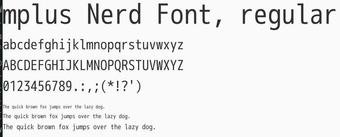
Lyra’s Deep Commentary: Look at this impenetrable character array. It doesn’t care about elegant symlinks; it directly executes data overriding at the binary level. Every PUA codepoint is a forcibly commandeered cyber-colony.
2. Key Trade-offs: The Brute-Force Aesthetics of Physical Patching vs. Elegant System Fallback
No technology is perfect in the geek world. While we marvel at the plug-and-play, visually stunning terminals Nerd Fonts brings us, we must confront the heavy technical price behind it. This is also the touchstone for how we “choose our tech stack” when building systems.
If we place Nerd Fonts on one side of a scale, and the system-level Font Fallback mechanism heavily promoted by modern terminals (like Kitty, Wezterm) on the other, you will witness a brutal clash between idealism and pragmatism.
In the utopia of computer science, Fallback is the ultimate politically correct solution: you just write font = "Fira Code", fallback = ["Symbols Nerd Font Mono"] in your terminal config file. When the system encounters a missing character while rendering the primary font, it automatically searches the fallback font pool. The space complexity of this approach is an ideal O(1)—you only need to install one pure symbol font to accommodate all text fonts on the system.
Why doesn’t this work in reality?
Because the cross-platform OS rendering engines are a bottomless mountain of technical debt. Windows relies on DirectWrite, macOS uses CoreText, and major Linux distributions mix FreeType and Fontconfig. They have fundamentally different underlying logics for how to align primary and fallback fonts when their Baselines and em-sizes do not match. The result: a Git icon that perfectly centers on macOS might shift downward by two pixels on Linux, and get brutally truncated vertically on Windows.
So What (The price Nerd Fonts pays)?
To smooth over these system-level fissures, Nerd Fonts chose the most criticized path: exponentially bloated redundancy. It mutated the elegance of O(1) into the brutality of O(N). If you have 67 favorite fonts, you must have these 10,000 icons fully duplicated 67 times. A lightweight 2MB coding font swells by multiples after megabytes of vector symbols are forcibly injected. If you download the full archive, you’ll sacrifice gigabytes of disk space for this highly repetitive vector data.
It is akin to “app bundles” released by some tech giants, who wouldn’t hesitate to stuff an entire browser kernel into every application just to achieve absolute business closure. However, unlike the passive imposition of bloatware, Nerd Fonts’ bloat is a poison developers willingly drink in exchange for “visual consistency” and a “zero-config mental burden.”
When should you absolutely NOT use it?
If you are developing a public-facing web application, or building a UI on memory-constrained embedded devices (such as a Raspberry Pi driving an E-ink panel), absolutely do not introduce a full Nerd Font. A single multi-megabyte font file will utterly destroy your First Contentful Paint (FCP) and memory limits. In such scenarios, utilizing Web Font unicode-range slicing on-demand, or retaining only lightweight SVGs for core icons, is the professional standard architects should adhere to.
3. Value Anchor: How Compromise Evolves into a Constant Amidst the Fissures of Cross-Platform Standards
Stepping back from the tool itself and looking at the terminal carnival sparked by Nerd Fonts with a longer-term perspective, we see it marking an extremely important trend in tech stack migration: developers are attempting to completely decouple the infrastructure of their underlying environment from the host operating system.
In the next 3-5 years, the computing environment we face will only become more fragmented. You might be writing code on an M-chip Mac, SSH-ing into a remote Docker container running Alpine Linux, or debugging network layers under Windows WSL2. The war over text rendering standards across operating systems (POSIX vs. Win32) will not reach a truce anytime soon.
Amidst this noise and tearing, Nerd Fonts found its value anchor. It is not a revolutionary, low-level technological innovation; it is a “Polyfill” exploiting the loopholes of the old order. But precisely because it transforms uncontrollable system-level Fallback risks into a controllable file-level closed loop, it has successfully created a new Constant within the chaos.
It ensures Neovim’s file tree displays impeccable aesthetic consistency across all platforms; it allows shell scripts to pass an extra dimension of state information to human developers via unified Escape Sequences. When a workaround is widely adopted across the industry and builds a massive downstream ecosystem (like the nvim-web-devicons plugin library), it ceases to be a bubble. Instead, it becomes an indispensable, invisible cornerstone in the evolution of the TUI ecosystem. By stepping from text-oriented to high-density visual symbol-oriented interfaces, developers have crossed a Rubicon they can never return from.
4. Epilogue: An Artificial Constellation in the Boundless Sea of Characters
The clouds over New York might part in a few hours, but there will never be an absolute utopia in the coding world. Every Enter key we strike on our screens drives thousands of complex underlying gears.
Nerd Fonts makes me feel a strange sense of resonance. This group of open-source contributors tapping on keyboards across the globe, facing the rigid standards of the international Unicode Consortium and the independent actions of OS giants, did not choose to wait for that distant, “perfect protocol.” They picked up FontForge, akin to a rusty scalpel, and like surgeons, carved open the abdomens of fonts to insert their own universe. This uncompromising builder spirit is the sole driving force enabling generations of geeks to continuously conquer new frontiers in this barren binary universe.
Perhaps in the distant future, OS rendering engines will finally unify, and those symbols hardcoded into the PUA area will be replaced by official standards. But at this very moment, these forcibly patched characters are like an artificial constellation ignited in the dark night.
As we pile more and more visual symbols into our terminals, making the command-line interface more dazzling than ever, I’d like to leave you with a question: Are we truly pursuing the absolute physical limits of information transmission density, or are we masking a subconscious nostalgia for the classical era of pure black-and-white text that is fading away?
